Let’s be real. It’s 2021 and people are spoilt for choice. No matter how popular, yours is one of the countless (and similar) eCommerce stores consumers can choose to buy from. Making your metaphorical boat sail in this sea of eCommerce stores requires your online store to be not just slick or flashy, but also distinctive, unique, and memorable. And the first step to that is understanding buyers’ psychology behind online shopping.
While any successful purchase is a behavioral function of several internal and external factors, you can and must aim to influence them on your Shopify store. Apart from the obvious ones like your site navigation, its usability, trust in your brand, page load speed, and so on, there is one underrated element you can optimize for to nudge visitors to convert.
With human attention spans now being compared to that of a goldfish, the aesthetics and cosmetics of your site can make or break the user experience. Reputed researchers have deduced through eye-tracking experiments that visual design can not just stimulate reactions in shoppers, but also influence purchase decisions.
What you need is to pay attention to the look and feel of your site, especially the color palette to ensure it contributes to a delightful user experience and nudges visitors to take the desired action.
However, modifying or optimizing your site’s color palette is as complex as it sounds. What you can do instead is focus on applying the principles of color psychology on other critical elements of your Shopify store, such as product labels to spark the desired actions.
We’ll discuss more about product labels in the following sections, but first, let’s go over the concept of color psychology and its relation to consumers’ buying decisions.
The basics: What is color psychology?
When you think of global behemoth brands such as Coca Cola, Spotify, Ikea, and McDonald's, what comes to your mind? Surely, the product they sell, but one thing you distinctly associate each of them with is a unique and distinctive color. Isn’t it?
That’s because your mind is conditioned to seeing the particular color in abundance every time you walk into their store or make an online purchase with them. The important thing to note here is that these eye catching colors were not just a conscious choice made by these brands after much careful deliberation, but also strategically integrated with their marketing and products to ensure they become an integral part of the brand’s identity.
Why you may ask? This is because colors have the power to influence emotion and trigger action. We might have not realized it, but each color unconsciously instills a certain emotion. Color psychology (or theory) is the art and science behind breaking down how colors affect behaviors and perceptions. In the digital world, color psychology refers to the theory behind understanding how your site’s colors influence its usability, user experience, and most importantly, buyers’ purchase decisions. Color theory, therefore, is an important pillar of persuasion that should undoubtedly be a part of every marketer’s playbook.
How does color psychology play with consumer emotions?
As many as 85% of shoppers claim color to be a primary reason for buying a particular product. Shocking, right? Well, not so much when you really get down to learn the nuances of color psychology.
No matter what the product, color is one of the top considerations for every buyer and has the power to make or break a deal. Not just that, colors have the power to trigger deep emotions and apart from being a catalyst that aids brand recall, it can really help you control buyers’ focus and attention. Therefore, by using them right, you can leverage colors to communicate messages, evoke emotions, and really make a difference when it comes to your store visitors’ purchase decisions.
Now, let’s get right into how different color families resonate with consumers and the myriad of emotions they trigger.
Yellow
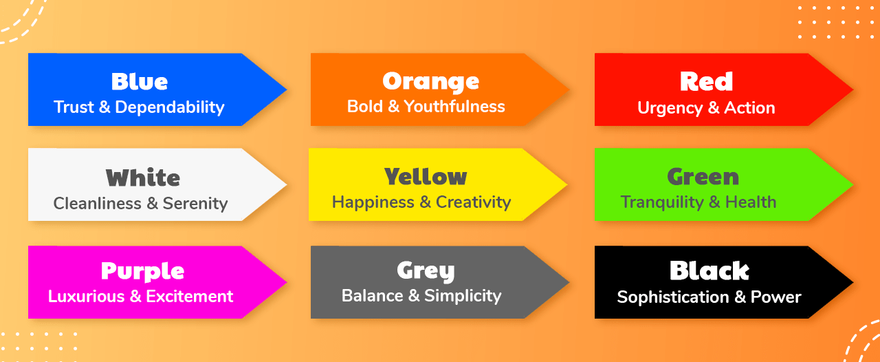
Yellow resonates with warmth, light, happiness, creativity, and optimism. Yellow is used by brands to invoke enthusiasm and positivity among consumers. Some of the most popular brands that come to mind at the thought of the color yellow are McDonald’s, Ikea, and Nikon.
Orange
Orange is another optimistic and fun color and is synonymous with youthfulness and cheerfulness. Orange is also bold, aggressive, and attention-grabbing, which is why you would often find CTAs and important signs painted in orange. Popular brands that use orange? Fanta, The Home Depot, and Nickelodeon.
Red
Red denotes boldness, action, urgency, excitement, and energy. Again a popular color used for CTAs, red is often used to grab buyers’ attention and create a sense of urgency and scarcity. Brands such as Target, Cocacola, and Virgin airlines come to mind speaking of the color red.
Purple
Moving away from excitement and aggression, purple lies on the other end of the spectrum and is often resonated with creativity, spirituality, and wisdom. It’s a calm and soothing color and is used by brands to express all things poetic and luxurious. Brands that use purple include Hallmark, Taco Bell, and Cadbury’s.
Blue
Wonder why banks and other financial service providers have blue as a prominent part of their color scheme? It is because blue is synonymous with trust, strength, and dependability. It is known to instill a sense of reassurance and security among consumers and some might also add that it’s probably one of the most liked colors. Think Dell, JP Morgan, American Express, Facebook, Twitter, and Oral B.
Green
Nature’s very own green resonates with serenity, relaxation, tranquility, harmony, health, peace, and wellbeing. This is probably the reason why countless organic personal care brands use green all across their marketing campaigns. It’s not too hard on your eyes and has a sense of calmness associated with it. Green brings to mind brands like Whole Foods, Tropicana, Spotify, and Holiday Inn.
White
It goes without saying that white is the color of light, cleanliness, serenity, calmness, and all things pure. It is often used by brands to denote integrity, goodness, and simplicity. Think Uber, Adidas, and CK.
Gray
Gray denotes strength, power, balance, simplicity, knowledge, and innovation. This is the primary reason why you see so many global technology and automobile brands use gray. Some of the most prominent examples include Apple, Honda, and Audi.
Black
Black is the ultimate choice among marketers to symbolize power, luxury, and sophistication. This is why a bunch of sports brands including Adidas, Nike, Puma, and luxury brands like Chanel and Louis Vuitton are all about black.
Colors and Types of Consumers
Now that we’ve gone over how colors instill emotions and feelings and what they say about a brand, let’s look at how various color families trigger specific types of shoppers. This will help you carefully use such colors on your Shopify store and in your marketing campaigns to attract such buyers and get them to hit ‘Buy Now’.
There are typically three types of buyers you’d want to target. These are impulse shoppers, budget shoppers, and conventional buyers. Here are some of the colors you can use to persuade buyers from each of these categories:

Orange, Red, Black, Blue - Impulse Buyers
These are shoppers who easily give in to their impulses and are more than eager to click ‘Buy’ if they really love your products. What you need to do here is to attract these customers to your products, latest offers and deals, new launches, and so on. Use orange, red, blue, and black as these are colors that make people buy. These tend to stand apart and hold the attention of impulse shoppers, getting them to notice your collection and offers.
You would often find clearance and seasonal sales on Shopify stores with red, blue, and orange CTAs to grab attention and create a sense of urgency.
Navy, Blue, Teal - Budget Shoppers
Shoppers who are on a budget need to be completely assured of their purchase and demand a sense of security before they are willing to spend on a product they find online.
Therefore, colors such as blue and green instill that vote of confidence in them along with a sense of security that nudges them to go ahead and make a purchase. This is probably why it makes sense for stores that specialize in expensive and niche products or services that drive budget-oriented shoppers to use navy blue, teal, and green on their site.
Pink, Sky Blue, Rose - Conventional Shoppers
If you own a traditional or age-old business that deals with very conventional buyers, it makes sense to use more positive, reassuring, soft, and calm colors such as pink, rose, and sky blue. Since these shoppers are not likely to get attracted to loud and aggressive colors, you want to use safer ones that are soothing to their eyes and make them want to stick around, explore your offerings, and not get overwhelmed by the excessive use of bold colors.
Takeaway
While it is always a great idea to incorporate relevant colors in your store design, you want to stick to a specific color scheme so that the entire look and feel of your brand stays consistent and coherent.
What are product labels and how do they help?
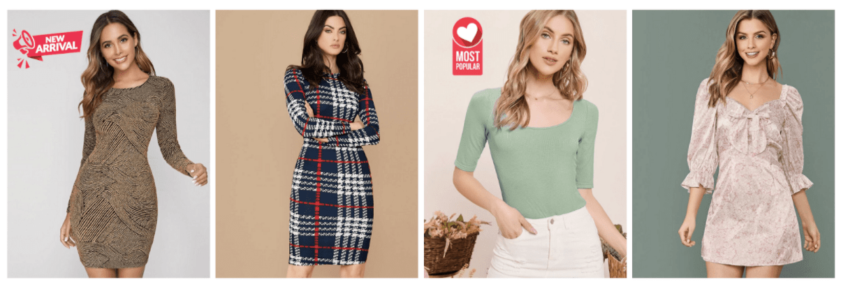
Product labels are the digital equivalent of shiny, bright stickers that can be added to the product images on your online store to grab shoppers’ attention. Put simply, they are used to evoke certain emotions in online shoppers by mentioning exciting details about the product.
For instance, stickers such as ‘Sells Fast’ and ‘On Sale’ create a sense of urgency among buyers, subtly nudging them to bag their favorite products. Others such as ‘Bestseller’, ‘Trending’, and ‘Most popular’ can help draw attention to most sought-after products and instill a sense of confidence among buyers in the credibility of the product. Here’s what product labels look like:
With ever-depleting human attention spans, these subtle nudges that product labels provide can go a long way in not only keeping shoppers glued to their screens, but also make it quicker for them to check out fast selling, popular, and discounted products.
This doesn't end there. You can also use these tiny magic stickers to offer personalized recommendations using labels such as ‘Frequently bought together’, ‘Customers also bought’, and so on. These will uplift your AOV, provide excellent cross-selling opportunities, and help buyers make quicker decisions.
Apart from focusing on the product labels’ text, it’s also important to leverage color psychology here to use the right shades with the right product so you can evoke the desired reaction and behavior in your audience and get them to click. In fact, color theory is not merely limited to your store's overall design and marketing campaigns but can be tremendously helpful if used on your product labels.
You can use the principles of color psychology we had discussed above to decide which color you must pick for which sticker and which product. And ta-da! These virtual stickers can help you use colors effectively to win over your visitors, draw attention to your products, and offer unique shopping experiences.
How to Use Color Psychology in Product Labels to Increase Conversion Rate
1. Identify what you want to use product labels for
The first step is to identify the exact use case for your product label. Do you want to use one for declaring a flash sale, marking trending/popular items, or mentioning the discount on the products? This will help you zero in on the overall emotion you wish to convey with the particular label.
2. Take a look at your store’s color theme
The one thing you want to make sure is that the colors you choose complement the overall color palette of your site. Therefore, it makes sense to first make a note of the kind of colors featured on your Shopify store so you can decide the hues for your product labels accordingly.
3. Take note of commonly associated colors with the promotion you’re making
If you are running specific promotions during Christmas or Black Friday/Cyber Monday (BFCM) or Valentine’s day, take a step back to make note of the colors associated with these festivals. Green/red during Christmas, red for Valentine’s Day, and black for BFCM. These are colors people resonate with at these times of the year and you wouldn’t want to miss out on an opportunity to share the holiday spirit and use it to get shoppers excited about your store.
4. Analyze what kind of shoppers will be purchasing from that promotion
We already discussed the types of buyers you typically attract on your Shopify store. Be sure to analyze which specific ones of those personas you wish to target during this promotion so you can choose your colors as per the guide above.
For instance, if you are running a campaign specifically to target impulse buyers by creating a sense of urgency with exclusive, time-bound deals, you might want to color your product labels orange, red, or blue to catch their attention and get them hooked.
5. Customize and display your product label with ModeMagic
Finally, once you have decided what your product labels are going to look like, you can simply go ahead and get them added to your products on ModeMagic. A smart Shopify automation app, ModeMagic allows you to quickly add, edit, customize, and design labels for your products over an easy-to-use dashboard. ModeMagic literally has a product label for everything and you even get to customize your very own labels in case you are looking for something highly specific. You can choose ones that match your store theme and design, language and add them to your product images within seconds.
Increase Shopify sales using color theory on product labels today!
Color theory and product labels are two powerful tools you have at your disposal that can help you make the most of your Shopify store, and lucky for you, they are a match made in heaven. If leveraged wisely, you can benefit greatly by using the right hues on your product labels to make your Shopify sales skyrocket. It’s now time to put the theory to test by creating eye-catching product labels on ModeMagic for your next big promotion so your customers can’t help but fall in love with our brand.


