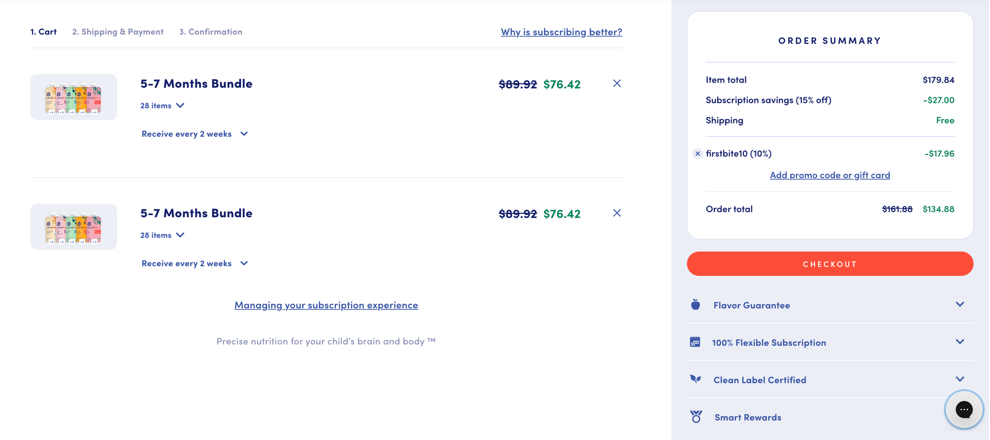
As an e-commerce business owner, you know how important it is to create a seamless shopping experience for your customers. One crucial element of this experience is the cart page, where customers can review and manage the items in their shopping carts before making a purchase. In this article, we will discuss
- The importance of cart pages and whether you need one
- The latest trends in cart page design
- How to measure the impact of your cart page, and
- Creative optimization strategies
What is a Cart Page?
The cart page, also known as the shopping cart page, is the page on your website where customers can view the items they have added to their cart. It displays information such as
- Product name, image
- Price
- Quantity
- Total amount
- Promotions/ discounts
From the cart page, customers can typically adjust the quantity of items, remove items, apply discount codes, and proceeds to checkout to complete their purchase.
It is the last step in the purchasing process before customers enter their payment and shipping information.
Is it essential to have a cart page for your online store?
The short answer is it depends.
A cart page is an essential component of any e-commerce website. Without a cart page, customers would have to make individual purchases for each item, which is not practical.
A cart page streamlines the purchasing process and makes it more convenient for customers to complete their purchases. Additionally, a cart page allows customers to review their orders and catch any errors or make any last-minute changes before finalizing the purchase.
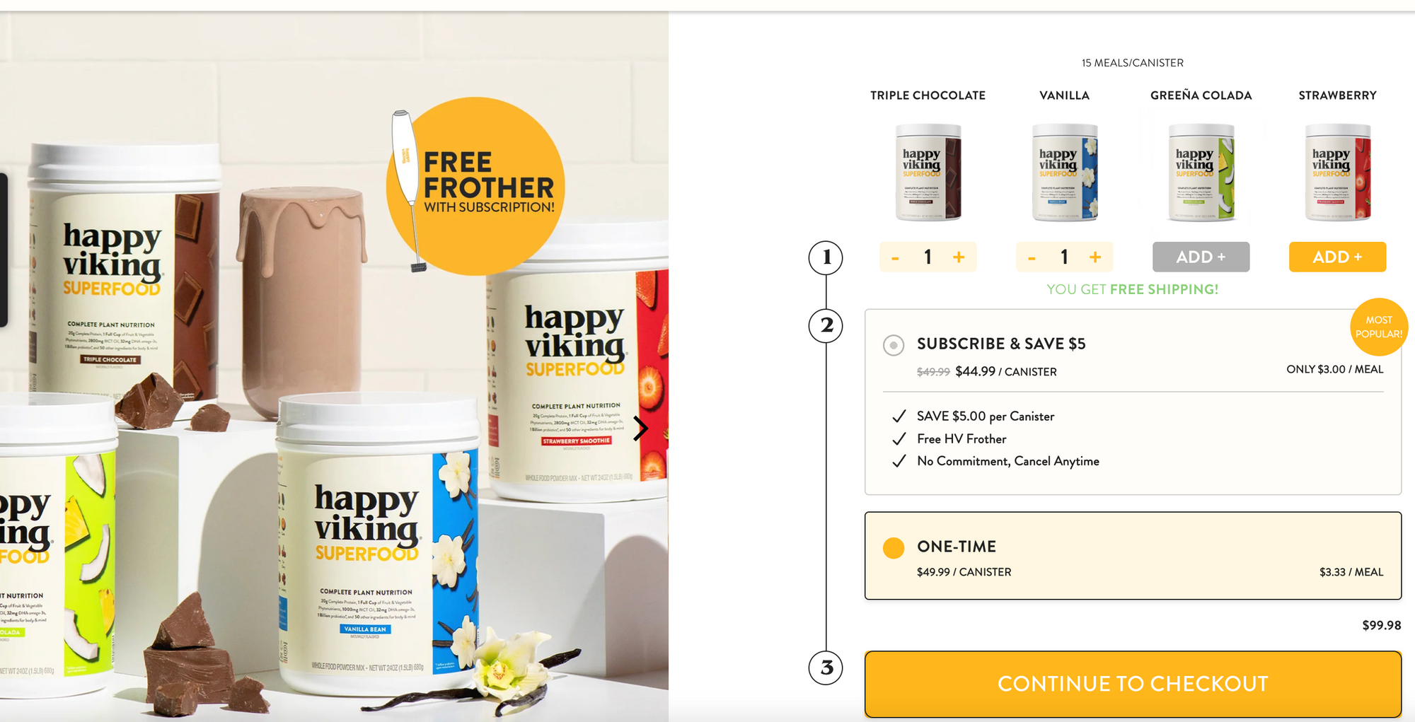
That said, the concept of the traditional cart page as a separate page that customers navigate to is fast changing. If your product catalog is small (less than 5 SKUs), be bold, and experiment to see how knocking out that cart page will move the needle towards higher conversions.
For example, see how the plant-based protein shake, Happy Viking, eliminates the cart page altogether. The option to checkout is integrated within the product page, directly leading customers to the payments and shipping details.
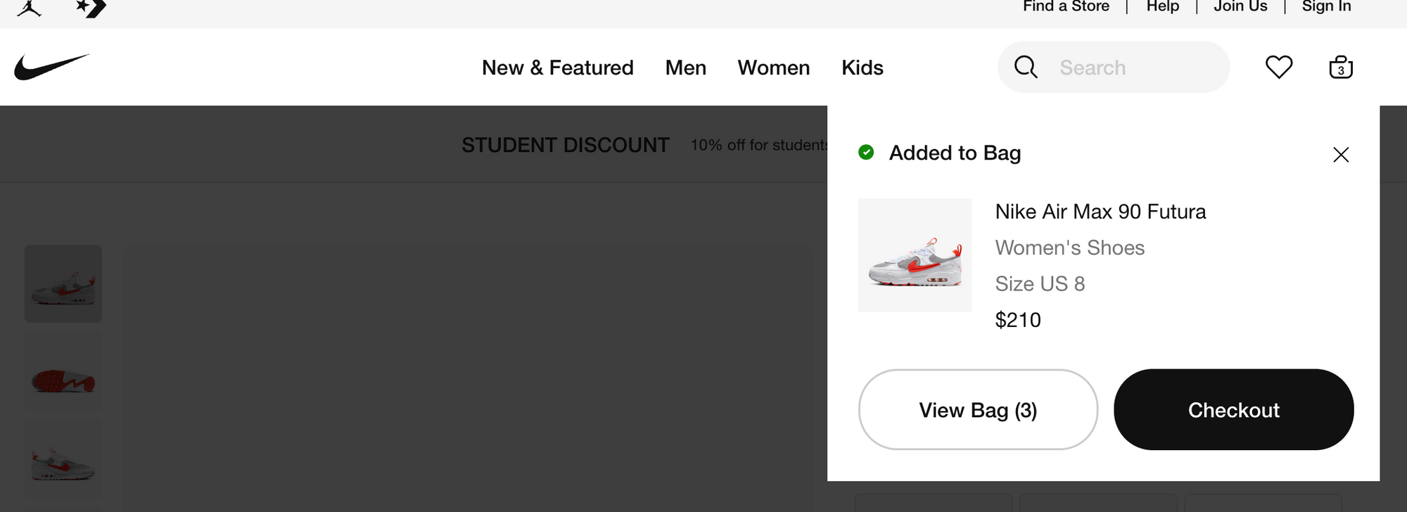
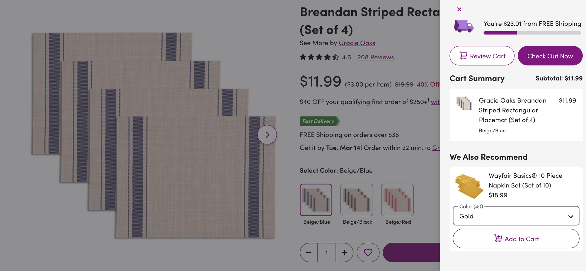
However, if that's too radical for you, there is a middle path. In order to reduce clicks and provide a seamless shopping experience, more brands are opting to display the cart as a slide-in or pop-up window rather than a separate page.
This allows customers to review and edit their cart without leaving the product page they're on. Here's how it looks:
- Customer adds an item to their cart
- Sees a small notification that confirms the item has been added.
- Customers continue browsing the site and shopping.
- They can see a summary of their cart in a slide-in window when they hover over the cart icon.
It's worth noting that while minimizing the cart page can be effective in reducing friction, it's not always the right choice for every brand or customer.
For example, pop-ups or slide-ins can be perceived as intrusive or pushy for a premium or luxury brand. Instead, such brands may opt for a more seamless and subtle shopping experience that aligns with their brand image and values.
Ultimately, whether or not a cart page is necessary depends on factors such as the complexity of the product catalog, the number of steps involved in the checkout process, and the target audience's preferences.
Measuring the Impact of the Cart Page
To measure the effectiveness of your cart page, you can use a combination of analytics tools and tracking metrics. Tools like Google Analytics, heatmap, and click tracking tools help you monitor the metrics and make data-driven decisions about optimizing your cart page.
Time to checkout
This metric measures the amount of time it takes for users to complete the checkout process after adding items to their cart.
A long time to Checkout may indicate issues with the checkout process, such as a complicated form or slow page load times, and may require changes to improve the user experience and increase conversions.
Cart abandonment rate
This metric measures the percentage of users who add items to their cart but do not complete the purchase.
A high cart abandonment rate can indicate issues with the cart page design or checkout process and may require changes to improve the user experience and increase conversions.
Click-to-conversion rate
This metric measures the percentage of users who complete a purchase after adding items to their cart.
A low conversion rate may indicate issues with the cart page design or the checkout process.
Average order value (AOV)
This metric measures the average value of each purchase made through the cart page.
A higher AOV indicates that customers are purchasing more items or higher-priced items, which can help to increase revenue for the business.
Number of unique SKUs per order
An often forgotten metric, the number of SKUs per order provides valuable information on how many different products your customers purchase on average.
Monitoring this metric, along with AOV, can help identify patterns in customer behavior and adjust their cart strategy to improve the customer experience.
Creative Optimization Strategies
Here are some creative optimization strategies you can use to improve your cart page and boost conversions:
Personalization
Adding a product to cart is the first signal that a customer is interested in purchasing the product.
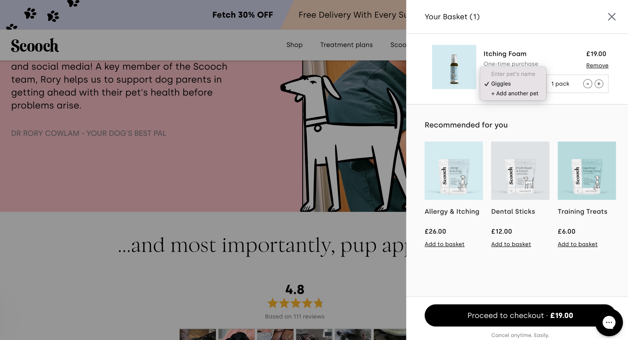
It's your customer saying, 'Hey! I think I like you'. So take the opportunity to reciprocate the love. Tell them who you are, what your brand is all about, and that you care about their choices. Personalize the interaction.
For example, pet food retailer, Scooch, uses the cart page to ask customers the name of the pet they are purchasing for. They use this information to connect with their customers better as part of unboxing and email communications.
Implement Free Shipping Thresholds
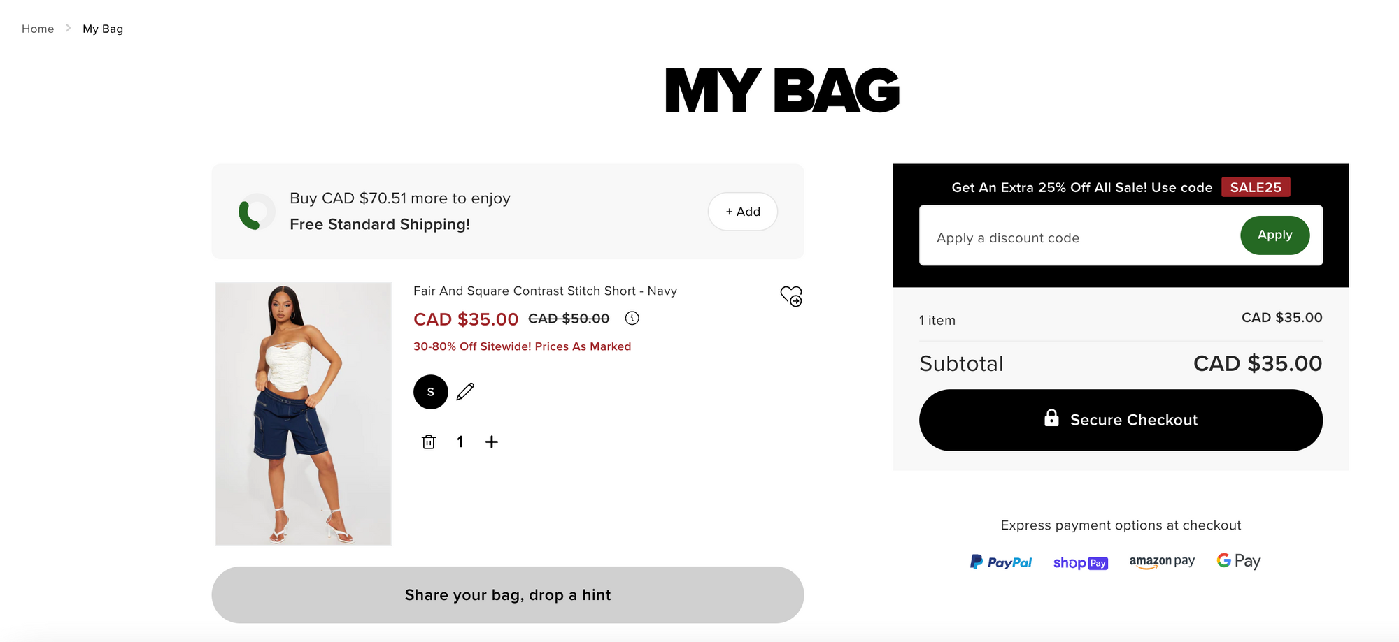
Consider offering free shipping when customers spend a certain amount on your website. This can incentivize customers to add more items to their cart and complete their purchases.
Use Social Proof
Displaying customer reviews, ratings, or testimonials on your cart page can increase trust and confidence in your products.
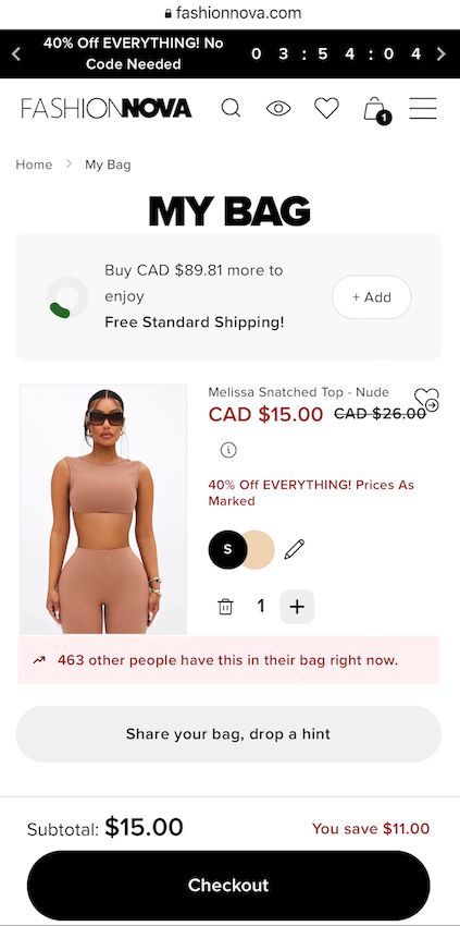
Alternatively, encourage customers to share their cart on social media channels like Fashion Nova does.
Cart Timeout
The concept of cart timeout typically involves setting a specific time limit for customers to complete their purchase before the items in their cart are removed or made unavailable.
This is often used as a strategy to create a sense of urgency and encourage customers to make a purchase decision quickly.
During the timed cart period, the items in the customer's cart are typically reserved for them and are not available for purchase by other customers. This can create a feeling of exclusivity and motivate the customer to complete their purchase before the timer runs out.
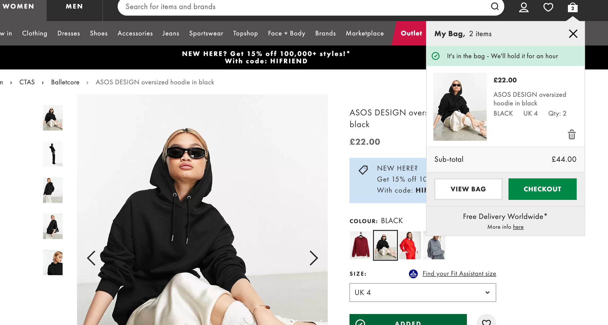
See how the clothing retailer, ASOS, uses cart timeout to generate urgency and get customers to checkout fast.
Conclusion
In conclusion, the cart page is an essential part of the e-commerce shopping experience, and optimizing it can have a significant impact on your conversions. By staying up-to-date with the latest trends in cart page design and using creative optimization strategies, you can create a seamless and personalized shopping experience for your customers.
Frequently Asked Questions
What is the ideal layout for a cart page?
The ideal layout for a cart page may vary depending on the specific website and target audience, but here are some best practices:
- Clear and concise product information
- Prominent CTA's such as "Proceed to Checkout" or "Secure Checkout"
- Shipping and tax information
- Upsell and cross-sell opportunities
- Trust badges and security information
How can I reduce cart abandonment due to unexpected costs?
Unexpected costs, such as shipping fees or taxes, can lead to cart abandonment. To reduce this, ensure all costs are clearly displayed on the cart page, including shipping and handling fees, taxes, and other charges. Consider offering free shipping or flat-rate shipping to minimize unexpected costs.
What are some ways to streamline the checkout process on the cart page?
Here are some ways to streamline the checkout process on the cart page:
- Offer guest checkout option
- Auto-fill form fields
- Use progress indicators to highlight the number of steps remaining
- Provide multiple payment options
- Ensure mobile-friendly design
- Remove unnecessary distractions and information overload
How can I use retargeting to optimize my cart page?
Retargeting can be a powerful tool to bring customers back to their abandoned carts. Here are some ways to do it:
- Use dynamic retargeting ads to show customers the exact items they left in their cart, along with related items or promotions. This can be a powerful reminder and encourage them to return to the cart page.
- Send cart abandonment SMS messages to reach customers and encourage them to return to their abandoned cart. Use personalized messaging and incentives to make the message more compelling.
- Use exit intent pop-ups to show customers a special offer or incentive when they try to leave the cart page or website. This can be a last-minute reminder of the items they left in their cart and encourage them to complete their purchase.
What are some tools I can use to improve the performance of the cart page?
Here are some tools:
- Cart experience - ModeMagic (Product recommendations), TargetBay (Customer Reviews)
- Cart recovery - ModeMagic (Personalized discounts), Aimtell (Push notifications), Pushowl (Push notifications), Marcello (Email, Pop-ups, FB messages)
- Cart engagement - Ecodrive (Plant a tree from cart page)
Which CRO experts should I follow to learn more tips?
Here are some CRO experts you can follow to learn more tips on how to improve cart recovery:
- Adam Pearce (CEO, Blend Commerce)
2. Jon Macdonald (Founder, The Good)
3. Lorenzo C (CRO/ Experimentation Consultant)
4. Adam Kitchen (CEO, Magnet Monster)
5. Will Laurensen (CEO, Customers who click)

