Are your visitors getting stuck on their path to purchase?
As an online retailer, your ultimate goal is to convert site visitors into paying customers. The store funnel has many components to optimize sell-through. The product page is one of the most important, as this is where consumers spend time. Optimizing your product pages to increase add-to-cart rates immediately impacts revenue.
In this article, we deep dive into how to improve product pages by aiming to
- Understand the customer journey within the Product page
- Identify areas for improvement using key metrics
- Implement strategies to improve the metrics
Understanding the customer journey within the Product page
Customers spend most of their time on a website on the Product details page. It is essential to have a clear view of customer's the journey within the product details page. This can provide valuable insights into critical drop-off points. You can optimize the product page by taking advantage of such insights.
Let's dive into the customer's journey within the Product Details page:
Step 1: Arrival on the Product Details Page
Step 2: Product Presentation
Step 3: Product Comparison
Step 4: Social Proof
Step 5: Payments and Delivery
Step 6: Call-to-Action
Step 1: Arrival on the Product Details Page
The customer arrives on the product details page after clicking on a product image or product link from the search results page, category page, or other sources.
At this point, the customer evaluates if the product meets their needs and whether it's worth further consideration.
Differentiators: Visual elements such as high-quality images, videos, and animations that help customers understand the product better create a positive first impression of the product. This can encourage customers to spend more time on the page and engage more with the product.
Protip
Step 2: Product Presentation
The customer is presented with product information, including the features, benefits, and pricing details. The customer evaluates whether the product meets their needs and whether the information provided is sufficient.
This stage impacts customers' perception of the product and willingness to purchase.
Differentiators: Using clear and concise copy to describe the product and its features, focusing on the benefits and how the product can meet the customer's needs.
Protip
Step 3: Product Comparison
The customer compares the product with similar products or different variations of the same product.
In this stage, the customer evaluates the differences between the products and their features to determine which product meets their needs best.
Differentiators: If the product has similar options or competitors, providing a comparison table showing the differences between the products helps keep customers informed and choose the product that best meets their needs. Otherwise, customers will leave your store to look for comparison information on other sites.
Protip
Step 4: Social Proof
The customer looks for reviews, ratings, and testimonials.
In this stage, the customer evaluates other customers' experiences and opinions of the product to determine whether it meets their expectations.
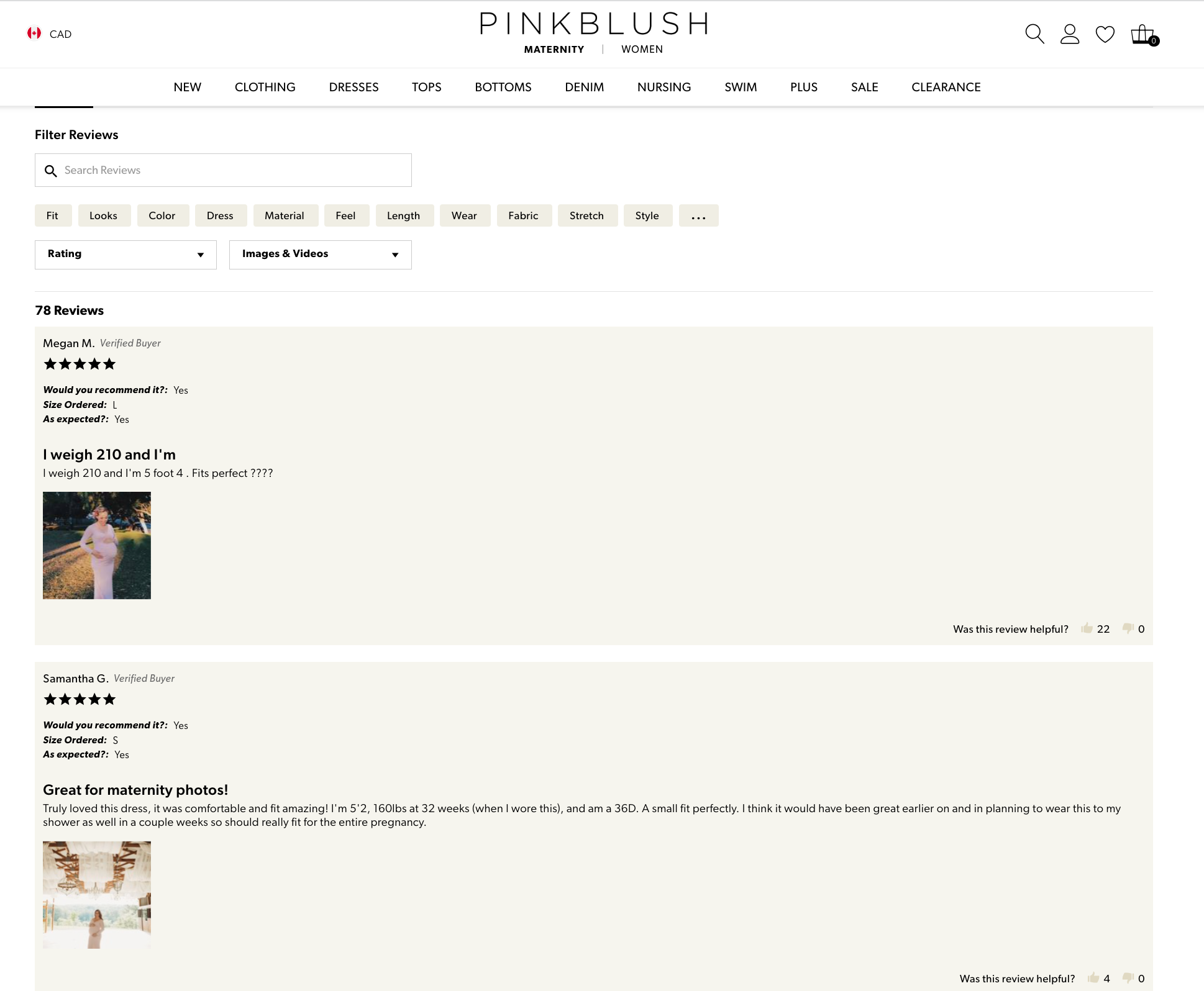
Differentiators: Social proofs are more than just helpful in providing social validation and building trust. More importantly, user-generated content, such as photos and videos of customers using the product, can provide powerful motivation to get customers over the line.
For example, PinkBlush, a maternity clothing retailer, lets customers post reviews and photos on the product page that provides valuable information to prospective customers.
Step 5: Payments and Delivery
At this stage, the customer evaluates options regarding payment methods, shipping costs, returns, and inventory availability.
This is a critical phase when customers are closest to purchase decisions. Providing clear and accurate information that is visually appealing will encourage customers to move forward.
Protip
Differentiators: Customers want to know that they can get assistance if they have questions, concerns, or issues, and having customer support information readily available on the product details page can provide that reassurance.
For example, check out how Casper's mattress brand offers multiple gateways for customers to interact with support and the in-store team. This is especially effective for a mattress brand where customers look for a physical experience before purchasing.

Step 6: Call-to-Action
This is the final stage, where the customer decides to move forward in the purchase journey within the product details page. The customer may click the call-to-action button to add the products to their cart (Add to Cart CTA) or initiate the checkout process (Buy now CTA).
Consider your customer's purchasing behavior and preferences to determine the optimal buttons and their order for your product details page. For example, if your customers tend to make impulsive purchases, you prioritize the "Buy Now" button over the "Add to Cart" button.
Differentiators: Experimenting with different CTA's helps align more closely with customer needs and creates a sense of exclusivity and community around your products.
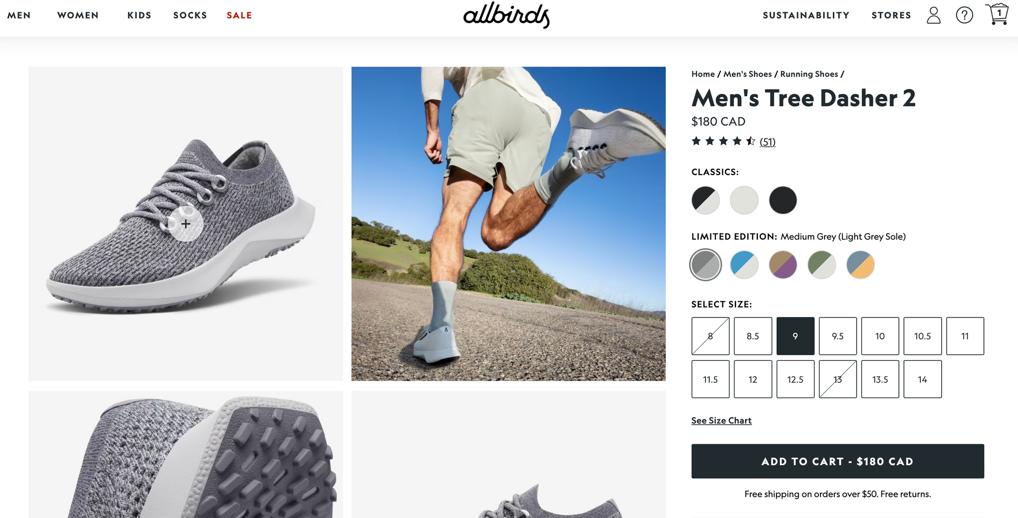
For example, Allbirds shows pricing on their CTA button to make the purchase process more transparent and easy for the customer. By displaying the price directly on the CTA button (with shipping and returns policy right below), customers can easily see the value when deciding to move forward.
Understanding the customer journey within the product details page allows you to optimize every stage to improve customer engagement and increase conversions.
Identify Areas for Improvement on Your Product Pages
Your route to higher sales is to identify drop-off points for potential customers and double down on that drop-off points to create an informative, engaging, and enjoyable shopping experience.
When identifying opportunities in your product pages, go through this checklist.
- Are the photos and imagery on the product page attractive and inviting?
- Do you have the necessary product specifications displayed clearly and concisely?
- Do the product descriptions accurately reflect the features and benefits of your products, with product comparison charts where applicable?
- Are the payments and delivery information clearly communicated?
- Does the layout make it easy for customers to find the primary CTA (Add to Cart or Buy Now) or ask for help quickly?
Additional guidelines on how to identify problem areas
Here are some top metrics to monitor to better understand where the optimization opportunities lie for your online store.
High bounce rate
If your bounce rate is high, visitors need to take action to leave your product page. This could be due to poor-quality visuals, product presentation, or an unclear value proposition.
Alternatively, watch out for other technical issues, including slow page loading time, poor mobile experience, or broken links and errors that can cause visitors to exit.
Low Time on Page
If visitors spend very little time on your product page, they are not engaged with your product. This could be due to poor product imagery, inadequate product descriptions, or a lack of customer reviews.
This metric is similar to the bounce rate but a better indication of the presentation not being engaging enough.
Low Scroll depth
Scroll depth indicates how far down a user has scrolled on a page. It provides valuable insights into how users are engaging with the product page.
If a low percentage of customers scroll past the initial product description or images, it indicates that they need help finding the information they need or are losing interest in the product as they continue scrolling.
Low Add-to-Cart Rate
If visitors are not adding your product to their cart, your product page must be more persuasive. This could be due to a lack of social proof, poor product reviews, or inadequate product descriptions.
Protip
High Cart Abandonment Rate
If visitors are adding products to their cart but do not complete the purchase, it means that there is a problem with your checkout process. Alternatively, this could mean high shipping costs or a need for payment options.
Displaying payments and delivery policies upfront on the product details page sets expectations and builds trust and transparency to get customers across checkout.
Time to roll up your sleeves
Once you've identified areas for improvement on your product pages, it's time to execute! While making changes might seem daunting, it's important to remember small steps can lead to significant improvements as they add up.
Here are immediate quick wins for you to get started immediately.
Quick wins to increase add-to-carts
Add a related products section
These come in different shapes and sizes, such as 'You may also like', 'Recommended products', 'People also viewed', etc. This is a great way to introduce new products to customers.
By offering a range of products similar to the one the visitor is currently viewing, the likelihood of the visitor finding products, they want to buy increases, thus leading to higher add-to-cart rates.
Tip: You can add a related products section in just a few clicks with ModeMagic’s plug-in for Shopify stores. Install the app from Shopify app store to get started.
Apply social media feed to product pages
Embed the social media feeds from Instagram, Twitter, Pinterest, or other social media platforms. This can be done using custom code, a pre-made plugin, or a widget that integrates with your eCommerce platform.
Additionally, you may make the feed interactive by allowing visitors to engage with the content by liking, sharing, or commenting. This can increase engagement and build a sense of community around your brand.
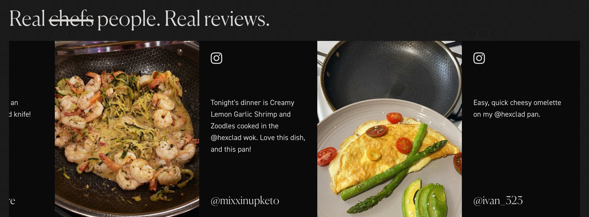
Check out how the cookware brand, Hexclad, showcases user-generated content as real reviews on its product page.
Add Targeted Calls-to-Action
Implementing targeted calls-to-action (CTA) is a great way to establish a brand-buyer connection.
Consider implementing different types of CTAs on different types of product pages. To elaborate, you can use a CTA that encourages customers to subscribe in case of a subscription service and one that enables them to add the item to their cart for physical products.
Further, consider the customer journey and use a CTA that encourages them to learn more about the product if they are viewing the page for the first time and a CTA that enables them to purchase the product if they have viewed the page multiple times.
Be imaginative with your CTAs and conduct thorough testing to see which ones work best.
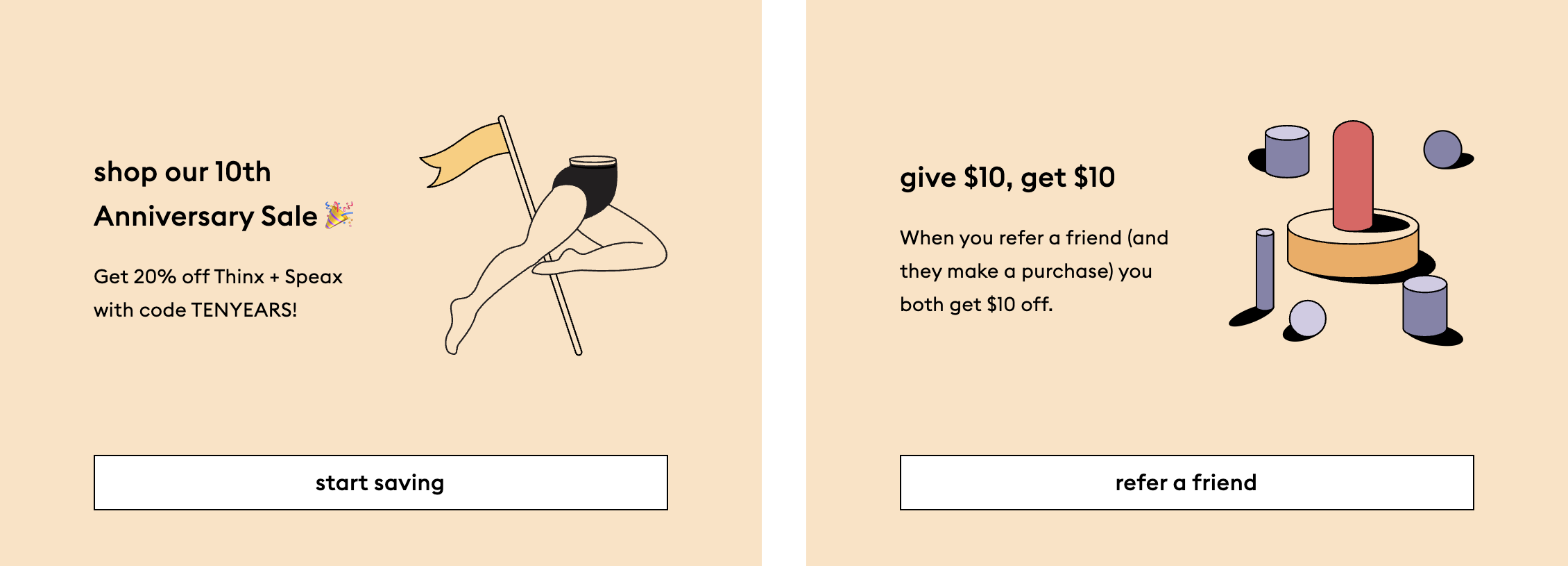
For example, See how the feminine brand Thinkx uses targeted CTA to get customers to the next step.
Conclusion
Following these tips can optimize your product pages and increase add-to-carts. This will help attract more customers and drive a higher conversion rate.
Remember, even small changes can make a big difference in creating an engaging and enjoyable online shopping experience for customers.
Frequently Asked Questions
What is the ideal length for a product details page, and how much information is too much?
Customers often scan product details pages rather than reading them in full. This means that the information on the page should be presented clearly, concisely, and visually appealing, with headings, subheadings, bullet points, and images to break up the text and make it easier to digest.
According to a study by Baymard Institute, the ideal length for a product details page can vary depending on the product, but it should be long enough to provide all the necessary information while still being easy to scan and digest. The study found that a product details page with an average word count of around 400-600 words was the most effective in user engagement and search engine optimization.
How do I write effective product descriptions for my product details page?
Here are some tips:
- Know your audience: Consider their needs, interests, and preferences, and use language and terminology that resonates.
- Focus on benefits, not just features: Make it more compelling and customer-oriented. For example, instead of saying, "this jacket has a waterproof shell," you could say, "stay dry and comfortable in any weather with our waterproof jacket.
- Use clear and concise language: Avoid using overly technical or complex language.
- Be descriptive and specific: Include a comprehensive product description, such as its size, weight, material, and distinct attributes or characteristics.
How many product images should I include on a product details page?
It's recommended to include at least 3-5 images per product.
How can I optimize my product details page for search engines?
Here are some tips:
- Use keywords in product titles, descriptions, and other metadata.
- Use keywords and descriptive file names, and alt text.
- Ensure that your product URL contains relevant keywords, making it easier for search engines to understand what your page is about.
- Encourage customers to leave reviews, as it can help improve SEO ranking.
What are some popular must-have tools for product page optimization?
Your choice of tech stack can depend on various factors, such as the website platform, budget, and specific optimization goals. However, here are some trending tools and technologies for product page optimization:
- Customer support - elfsight, Powr
- Conversion optimization - Modemagic (all things personalization, badges, and banners)
- Social proofs - Okendo, Growave(Instagram UGC)
- Heat mapping - Hotjar (for low-touch heatmap analytics)
- A/B testing - Optimizely, VWO
Who are some popular CRO experts to follow on social media?
- Adam Pearce (CEO, Blend Commerce)
2. Jon Macdonald (Founder, The Good)
3. Lorenzo C (CRO/ Experimentation Consultant)
4. Adam Kitchen (CEO, Magnet Monster)
5. Will Laurensen (CEO, Customers who click)

