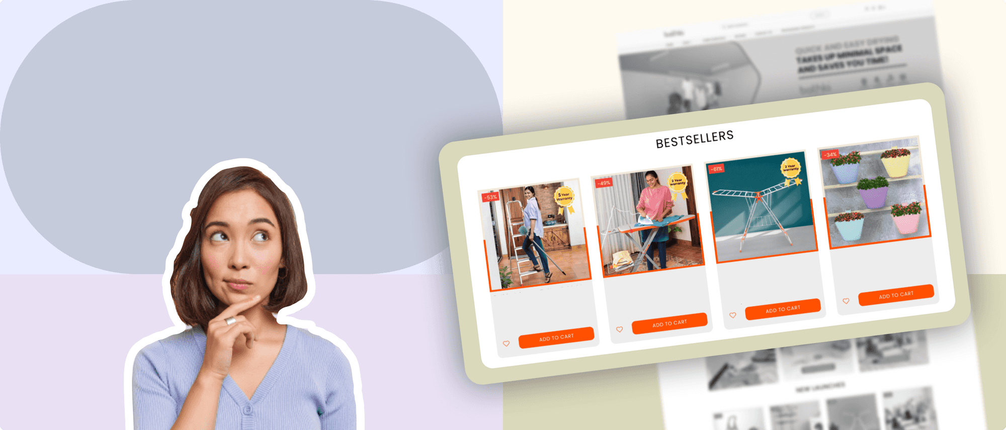
When customers visit an e-commerce website, they expect to find relevant products easily and quickly. However, browsing through a vast product catalog or collections can be overwhelming, especially if the customer is not sure about what they are looking for. A well-designed product listing page (aka collections or category page) helps
- Users browse through a vast product catalog more easily and efficiently.
- Provides all the necessary information about products to pique interest, such as pricing, size, color, and availability.
- Improves search engine optimization (SEO), as search engines index individual product pages in the listings, making it easier to capture customers with the highest intent.
In this topic, we'll uncover
- What are the essential components of a product listing page?
- What are the different layouts of the product listing page?
- What are some common pitfalls in designing a product listing page?
- Metrics to track the current performance of your listing page
- Deep dive into creative tactics that will enable you to improve conversions
What are the essential components of a product listing page?
There are certain essential components that should be included on a product listing page to ensure it is effective.
Product Image and Visual Aids
Visual aids can be a powerful tool in improving the user experience. The product image is one of the most important components of a product listing page. Therefore, it's important to ensure that their product images are high-quality, visually appealing, and accurately represent the product.
Additionally, consider adding a second image on hover to improve presentation and visibility further.
Some best practices for product images include:
- Using high-quality images that are at least 1000 pixels wide
- Using multiple images to showcase different angles and details of the product
- Using a white or neutral background to make the products stand out
Product Information
If the collections page does not provide enough information about the products, such as product descriptions, specifications, or customer reviews, visitors are less likely to make a purchase or even explore further. To avoid clutter, it is important to ensure that the information is specific and relevant as it can be.
Some best practices for product descriptions include:
- Describing features in a clear and concise manner
- Including keywords and phrases that customers may be searching for
- Including detailed specifications such as size, weight, and materials
- Using customer reviews and ratings to build trust
Product Price
The product price is perhaps the most important piece of information on a product listing page. Therefore, it's important for brands to ensure that their pricing is competitive and transparent.
Some best practices for product pricing include:
- Highlighting discounts or promotions where possible to incentivize purchases
- Including shipping costs and other fees in the price to avoid surprises
- Using dynamic pricing strategies to adjust prices based on customer behavior and market conditions
What are the different layouts of a product listing page?
You can use different types of product listings pages depending on the size of your catalog and what you are looking to showcase - Categories, Sub-categories, or SKUs.
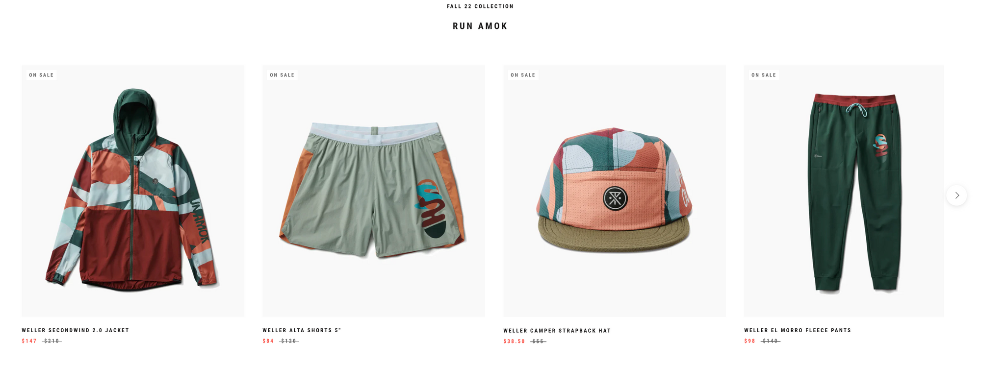
Carousel view
In carousel view PLP, products are displayed in a horizontal scrolling carousel, allowing customers to browse through a selection of products quickly. This view maximizes use of space, is mobile-friendly, and is an engaging way to browse the limited set of products.
Who is this for? Carousel view is a good choice for websites that want to showcase a small number of products in a visually appealing way. Alternatively, it is ideal for displaying high-level product categories.
For example, men’s fashion retailer, Roark, uses a carousel view to showcase products from their fall collection in a visually engaging way. By showcasing multiple items in a single location, customers can easily browse through the collection and find the ones that best suit their style and preferences.
List view
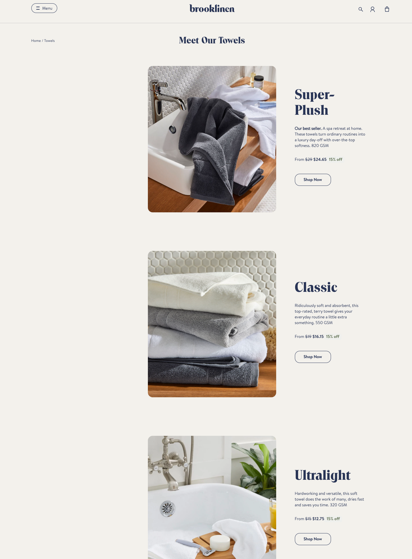
In a list view PLP, products are displayed in a vertical list with a larger product image and more detailed product information.
Who is this for? A list view is a good choice for websites with fewer products or where more detailed product information is required. Alternatively, this view is also ideal for showcasing sub-categories
Grid view
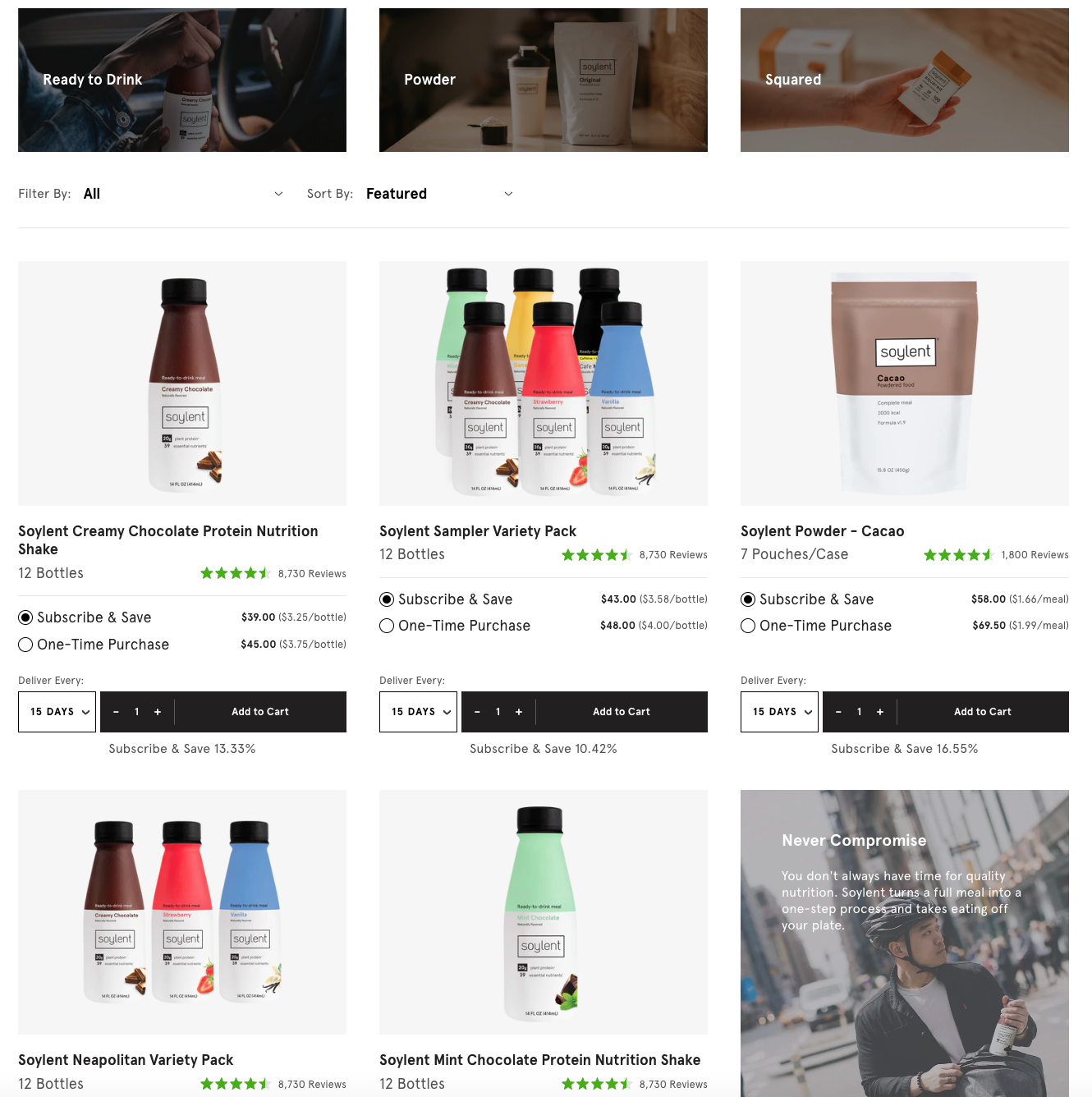
This is the most common type of PLP, where products are displayed in a grid with a thumbnail image, product name, and price.
Who is this for? Grid view is a good choice for websites with a large number of products, as it allows customers to browse and compare items alongside each other quickly.
For example, the meal replacement brand, Soylent, uses grid view to allow users to compare different flavors and SKU’s. Some nifty add-ons that make the comparison easier are the customer reviews, pricing, and quantity.
Filtered view
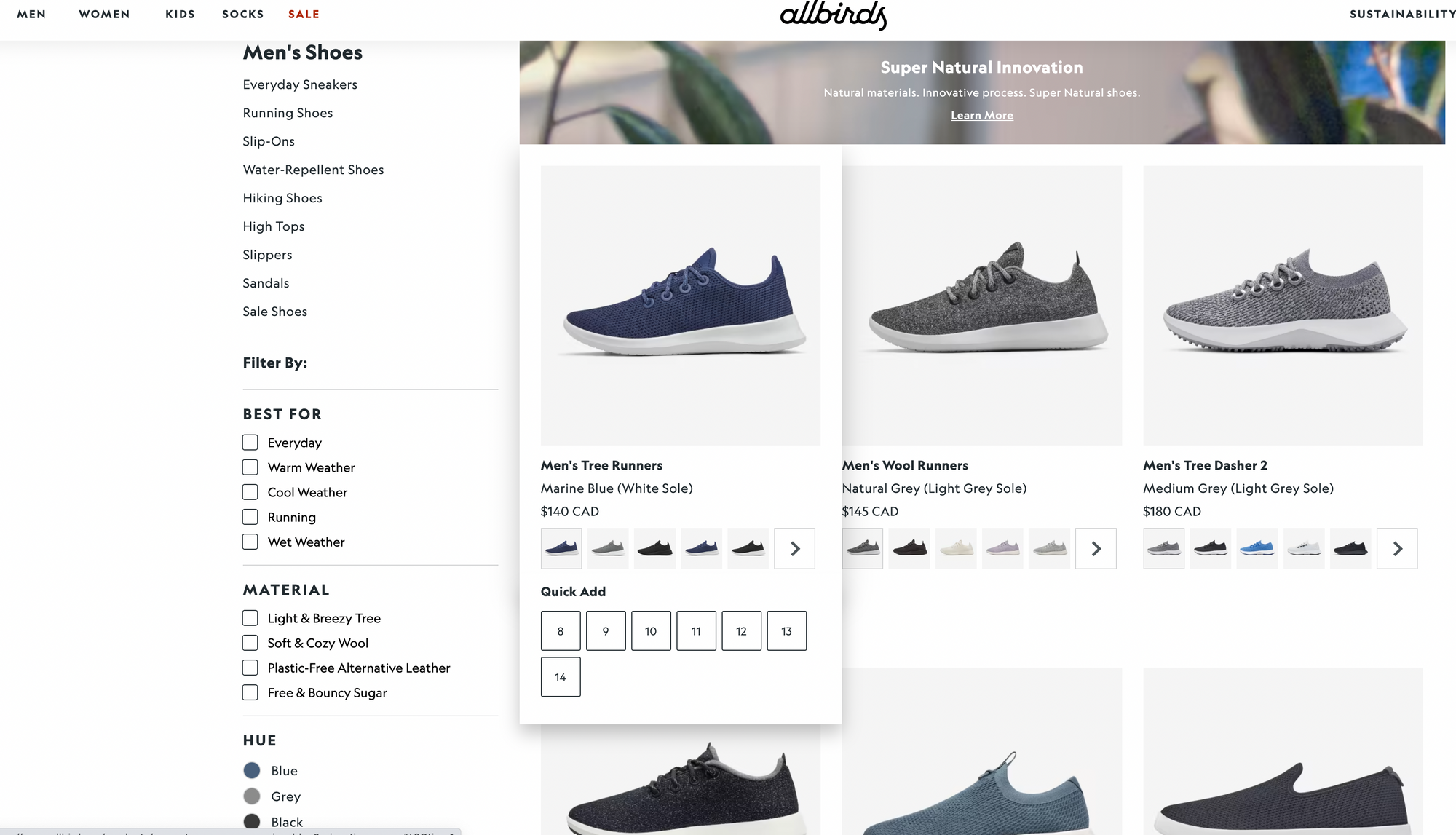
PLPs allow customers to filter the products on the page based on specific criteria, such as price, size, material or color etc.
Who is this for? This type of listing page is particularly useful for brands with limited categories (3 or less) but a large number of variants/ SKU’s. It also particularly works well when customers have very specific requirements and the product catalog is vast.
Additionally, it highlights the brand's focus on sustainability and eco-friendliness by allowing customers to search for products based on the materials used.
Dynamic view
In a dynamic view PLP, the products on the page change based on the customer's browsing history or behavior. This type of PLP is becoming more common as websites use AI and machine learning to personalize the customer experience. You can call this the future (not too distant) of product listing.
Who is this for? This technique typically involves the use of algorithms and data analytics to display personalized product recommendations to customers based on their browsing history, purchase history, and other relevant factors.
For example, Sephora uses dynamic view to recommend products based on a customer's purchase history and browsing behavior. They also use a personalized quiz to help customers find products that are best suited to their skin type and preferences.
Given the technical know-how needed for set up, this method has typically been used by large retailers. With apps such as ModeMagic, Shopify retailers can easily set up personalized quizzes and product listing at the click of a button.
What are some common pitfalls in designing a product listing page?
Watch out for these common mistakes some brands make, leading to sub-optimal performance of their online store. By avoiding these common pitfalls, you can create product listing pages that are intuitive, user-friendly, and effective in driving conversions.
Endless scroll leading to exits
As much as it is debatable, we strongly discourage infinite scrolling on your product listing page. Remember, our objective is to help customers find the products they need quickly and move them to the next step leading to purchase. Infinite scrolling keeps customers in discovery mode (forever), leading to frustration and exits.
How to address the issue - Incorporate better filtering and sorting mechanisms for the categorization of products.
Categories not aligned to needs
Think about what your customers truly care for and categorize your products accordingly. Not aligning product categories to the real needs of customers breeds confusion. This further stretches the time it takes for customers to find products they love, leading to drop-offs.
Here are some examples to help you categorize products better:
- Beauty - Categorize products based on personality traits such as "bold," "natural," or "glamorous," helping customers find products that match their personal style.
- Home decor- Create categories such as "trendy spaces" or "bohemian vibes" based on how customers are using their products in real life.
- Clothing - Create categories such as "workwear," "weekend wear," or "activewear" to help customers quickly find products that fit their specific needs.
That’s what we call as being customer-centric.
Too many categories
When there are too many categories, it can be challenging to ensure that each category is relevant and meaningful to the customer. Customers become overwhelmed and confused, resulting in exits. So the focus should be on creating a streamlined and intuitive listing with a limited number of categories that are relevant and meaningful.
Here are some guidelines on how to think about the number of categories.
- Depth of Your Catalog: If you have a large product catalog, you may need to create more categories and subcategories to help customers find what they are looking for. However, it's important to balance the need for organization with the need for simplicity and ease of use.
- Keep it Simple: It's important to keep the number of categories and subcategories to a minimum to avoid overwhelming customers. A good rule of thumb is to limit the number of main categories to no more than seven and subcategories to no more than five per main category.
- Consider Customer Needs: The number of categories and subcategories should be based on the needs of your customers. Conducting customer research and analyzing user behavior can help you determine what categories and subcategories are most important to your customers.
Pagination hindering SEO
Pagination on product listing pages can improve user experience by reducing clutter. However, having too many pages may result in a lower number of indexed pages and a lower search engine ranking. Additionally, If product pages are not properly paginated, multiple pages may compete for the same keywords, leading to keyword cannibalization and lower search engine rankings.
To avoid these issues, it's important to follow best practices for pagination, such as
- Clearly indicating page numbers, using consistent pagination styles
- Limiting the number of pages
- Providing a "show all" option
How to measure success?
To ensure that the collections page generates engagement and drives sales, it is important to measure its performance. By tracking the below metrics, you can gain insight into how well their collections page is performing and make data-driven decisions to optimize it for better results.
Here are the top metrics that will provide insight into how the collections page is performing:
Click-through rate (CTR)
This measures the number of visitors who click on a collection link to view the products. A high CTR indicates that the collection page is compelling enough to drive visitors to explore the products. This means the filtering and sorting mechanisms in the product listing page are helping customers find the right product.
Click-to-Conversion rate
This measures the percentage of visitors who click on a product and may go on to make a purchase. A high conversion rate indicates that the page is successful in driving visitors to make a purchase.
Average session duration
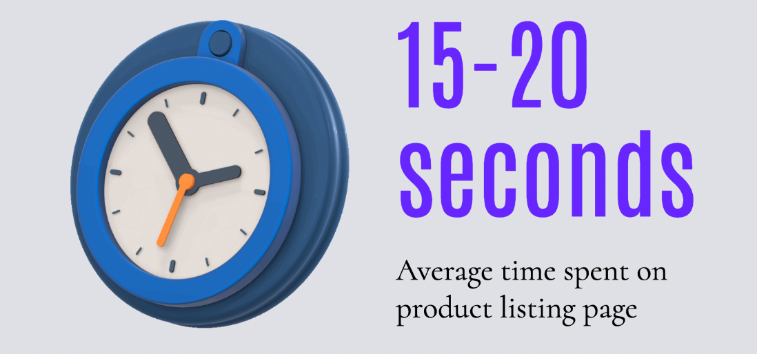
This measures the amount of time visitors spend on the collection page. A higher duration indicates that visitors are engaging with the page and potentially considering products from the collection. But watch out! If it's too high, it means customers are struggling to find products in the catalog. Remember, customers should be able to find the products they are looking for within maximum 3-4 clicks.
Some tactics to improve conversions
Here are some creative tactics you can you to drive further engagement and conversions of customers on the product listings page.
Calls to Action
The product listing page is not merely to aid discovery, but if leveraged well, can directly result in more add-to-carts and improved average order value.
By making it easier for customers to add products to their cart right from product listing page, customers are more likely to make additional purchases. Use of clear and prominent calls to action (CTAs) such as "Buy Now" or "Add to Cart" buttons in product listings will encourage users to take action.
Urgency and scarcity
The use of urgency and scarcity in e-commerce is a powerful tactic to motivate customers to make a purchase quickly. By highlighting limited-time offers or low stock levels by using product badges, brands can trigger customers’ impulse to buy.
This tactic can be particularly effective for high-demand or popular items, as customers may feel like they need to act fast to secure the item they want.
Use user-generated content (UGC)
User-generated content, such as customer photos or social media posts, can be a powerful way to showcase your products in a real-life setting. Consider adding UGC to your collections page to demonstrate the value of your products. This helps to create a more authentic and trustworthy experience for potential customers and encourages them to make a purchase.
Gamification
Use gamification techniques, such as quizzes or interactive product selectors, to help engage shoppers and increase the likelihood of a click. The gamification aspect of the quiz makes the shopping experience more interactive and fun for customers while also providing valuable information to brands about each customer's hair needs and preferences.
You can use a quiz on the product listing page that asks customers to answer questions about their needs and preferences. Once the customer completes the quiz, they are directed to a product listing page that showcases the personalized products that are suited to their needs.
Quick View
The quick view feature on a product listing page allows customers to get a brief overview of a product without having to leave the page. You display additional product information, such as color options, sizes, and reviews. This helps save time and makes the shopping experience more convenient.
Conclusion
In conclusion, a well-designed product listing page is a crucial element of an eCommerce website that can help increase conversions.
By using filtering and sorting tools, highlighting discounts and best-selling products, including customer reviews and ratings, and offering gamification, you can improve the user experience and build trust with potential customers.
Automated tools like ModeMagic can save the time and effort needed to launch these optimization tactics on your store.
Frequently Asked Questions
What are some popular must-have tools for Collections page optimization?
Your choice of tech stack can depend on various factors, such as the website platform, budget, and specific optimization goals. However, here are some trending tools and technologies for collections page optimization:
- Gamification - Justuno
- Conversion optimization - Modemagic (all things personalization, badges, and banners)
- Social proofs - Okendo, Growave (Reviews)
- Heat mapping - Hotjar (for low-touch heatmap analytics)
- A/B testing - Optimizely, VWO
Who are some popular CRO experts to follow on social media?
- Adam Pearce (CEO, Blend Commerce)
2. Jon Macdonald (Founder, The Good)
3. Lorenzo C (CRO/ Experimentation Consultant)
4. Adam Kitchen (CEO, Magnet Monster)
5. Will Laurensen (CEO, Customers who click)

