As an online store owner, you’re pretty engrossed in different marketing campaigns, trying to drive traffic to your Shopify store. This is a difficult thing to do. But there’s something more challenging: converting those visitors into paid customers.
According to the Q4 report by Kibocommerce, conversion rates in the U.S were as low as 2.3% across mobile devices. Similarly, the average ecommerce site sees an 80% cart abandonment rate, with the highest cart abandonment coming from mobile devices and social media.
The competition is stiff, and brands need to go beyond having great products to adding different elements of trust on their website to encourage visitors further to buy.
It can feel daunting to leverage conversion rate optimization tactics to boost your store’s conversion with many tasks to complete. However, by following the simple strategies in this post, you can learn how to increase sales on your Shopify store.
Let’s dive in.
1. Capture leads with popups
You’ve heard that popups are icky and frustrating, leaving visitors with a bad experience. But they can also be instrumental in driving awareness for your campaigns, promoting discount codes to first-time visitors, reducing cart abandonment, and ultimately driving more sales and revenue for your business. In fact, the average pop conversion rate grew from 3.09 in 2020 to 11.09 in 2022.
Using a targeted questionnaire and discount popups, Czar Jewelry grew its yearly sales by 26.2% and made 2300+ USD in revenue within 26 days.
What’s more, they also use exit-intent popups to reduce cart abandonment for their stores.
Most brands use popups the wrong way. Good popups benefit both the visitors and the brand: they brand drive awareness for its campaign and increase leads. The customers find what they need and get personalized offerings such as downloadables, product discounts, workshops, etc.
If you want the best results from your popups, avoid:
- Spin to win opt-in popups.
- Popups for people who clicked through from an email
- popups with your referral program immediately after purchase
- multiple popups with competing offers
Often, just following ecommerce best practices and visualizing your offers through the visitors’ eyes can help you create high-converting popups.
Be creative and optimize your CTA. Avoid showing popup multiple times so you don’t interrupt the user’s browsing experience. Create only responsive popups - popups visible across all devices, including desktop, mobile, and tablets. Be aware that CTAs are frequently highly valuable, and Shopify makes it simple to construct them. If you want a better grasp of how you should integrate CTAs in Shopify, consider investigating how the best Shopify developers design them.
2. Demonstrate your products with videos
Nine out of ten people who bought from a brick-and-mortar store wouldn’t do so if they didn’t get a feel or touch of what they’re buying. Similarly, videos replicate in-store experiences for online shoppers and let customers see the product in action.
Every shopper wants to be sure they’re getting enough value for the items they buy. 60% of consumers say online video has given them ideas and inspiration for their purchase.
A product video on your online store can help hook first-timers, increasing dwell time - time spent on each page - and giving them a slight nudge to make a purchase. Videos also take little time to consume, and it’s more engaging, making them a huge conversion driver.
What kind of videos should you create?
To boost your Shopify store conversion and impact the bottom line, each video on your site needs to tick the box and follow proven principles. While the video you choose will depend on your type of product and audience, here are some inspirations to get started:
Create videos that educate customers.
Show them new ways to use your product, e.g., the eight creative ways of folding a scarf. Customers want to know how to use your product in the best possible way. Show them that you care about their need by sharing inspiring examples and tutorials.
Unbox products with influencers.
Get influencers in your niche to unbox your products and explain all the great features.
User-generated content
Get your customers to post video reviews of the product or create videos of them using the product.
For best results and to encourage sharing on social platforms, aim for 30-seconds videos. You also want to ensure that the videos align with your brand values and story and include some form of entertainment while having the target customer in mind.
3. Use compelling product labels
Have you ever been to a retail store where the product you intend to purchase is labeled “Low in stock”? If so, I’d bet you split out your card and make the purchase instantly. Similarly, product labels can create a sense of urgency around your store’s items and encourage instant purchase.
They help you highlight new arrivals, low-in-stock items, popular products, and so on, building up trust and increasing your store’s average order value (AOV). In addition, retailers can use product labels to deliver stellar experiences during heavy-duty seasons like BFCM or Diwali sales.
For instance, you can double sales with labels like:
- Selling fast
- Trending now
- Bestseller
- New arrivals
- 15% off, etc.
Each product label must connect with customers through colors and tones unique to your brand. Color is critical because 85% of shoppers claim colors to be a primary reason for buying a particular product.
No matter the product, color is one of the top considerations for every buyer and has the power to make or break a deal. For example, it's well-known that the color red evokes feelings of aggression and urgency. The color yellow, on the other hand, is optimistic.
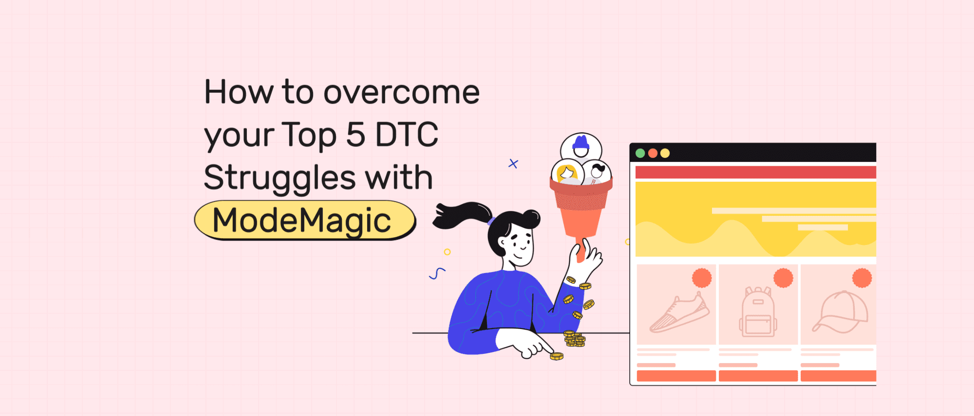
When deciding to use product labels on your site, consider your current and future needs and the nature of your online store. Hiring a developer may be the best solution for today if you have a big budget, but a powerful no-code automation Shopify app like ModeMagic can get you started quickly and support your future growth. It’s intuitive and lets you customize your design to fit your needs.
4. Use clean, high-quality product images
Think about your Shopify store as a physical storefront — it needs to be organized and ignite curiosity.
In a world where people have a short attention span, each product must be compelling, alluring, and eye-pleasing. That’s something you can accomplish with high-quality product images. A Weebly survey reveals that product images influence visitors' purchase decisions.
The first thing that your shoppers will see are your photos. If they like them, they’ll investigate the products, think about the price and quality, and ultimately purchase. If they don’t, they’ll move to your competitors.
Good product images give the shoppers clear differentiation between one product and another, highlight key features of each product, and demonstrate the product in action. For example, BPN employs high-quality lifestyle images to explain how their product can improve customers' lives.
6. Offer an Excellent Return Policy
Shoppers love to make risk-free purchase decisions, and over 60% of customers view the website return policy before making a purchase, according to TrueShip. Return rates across all industries jumped to an average of 16.06% in 2021, adding up to $761 billion worth of items that retailers will expect back in store. More than a quarter of merchants have seen an increase in returned items.
An excellent return policy is essential to nudge people towards clicking the order button; it can also increase retention. The goal of having a return policy isn’t to get the product back; it’s to get the customer to come back for more. However, you want to develop strict return policies to avoid manipulation and unnecessary losses.
A good return policy should address:
- Returnable items from bulk orders.
- The acceptable condition of the returned items.
- Length of days to process the return and deadlines (e.g., 30-day or 90-day policy)
7. Improve Site Performance and Speed
Whether you run a jewelry store or a classy lingerie store, your website performance and speed are closely tied to your online business's success. Imagine an interested buyer clicking the website link on your Instagram ads, only for the buyer to wait for an additional fifteen seconds to land on the site.
Having a slow-loading ecommerce website creates friction and sends impatient shoppers to competitors’ websites. 53% of mobile visitors will leave your site if it fails to load within three seconds. Site speed directly impacts user experience, sales, and conversion.
If you have a slow website, you can use Tryblackbird to optimize and monitor your site speed based on actual sales data and see how speed affects your conversion rate.
Increase conversion with proven tactics
It’s all well and good to drive visitors from Facebook, Instagram, and TikTok to your website, but you’re most likely going to lose your hard-earned investment unless it’s built for conversion.
Your main goal is to provide visitors with a great user experience and make it easy to click the “order” button. That requires deliberate action and a proven strategy.
In a world where shoppers’ behavior changes by the day, you need to continue iterating and optimizing your strategy to capture demand. Try A/B testing your strategy with different landing pages and tactics to see what works for your brand.


