Imagine that you have decided to go out to buy clothes. You are in a street where there are several stores. One store is quite generic, displaying some clothes on mannequins. Another store has an attractive sign about its new sale, and the mannequins have well-paired enticing clothes..
Which one do you enter? The second one? Guessed so.
Comparing the above example with your online eCommerce store: your landing pages act as your digital storefront, same as the exterior of a brick and mortar store.
In contrast, the product pages of your online eCommerce store are the look and feel of the interiors of an online store. There is a vast difference between the two, and most of the time, the importance of landing pages is ignored.
What is a Landing Page?
A Landing Page is a standalone page separate from your eCommerce product pages, built to achieve specific digital marketing goals.
Usually, the goal is to convert first-time store visitors to customers and retain repeat customers.
Product pages are the informative pages of your eCommerce store, while landing pages are customized for customer segments. Landing pages can increase your conversion rates and help you reach your specific marketing goal.
Here are some numbers to show what a landing page really means for your business: put across my point:
- Personalized Call-To-Action (CTAs) convert 202% compared to those landing pages that aren't. The personalization of landing pages ensures a higher conversion rate by focusing on the value the customer expects from the product or service.
- Using landing pages optimized by optimization software is seen to increase the average conversion rate by 30%.
- The average landing page conversion rate is 9.7%, which is excellent considering that the benchmark is 10%.
- By increasing the number of landing pages from 10 to 15, companies have noted a 55% increase in leads.
Best Practices for Building Landing Pages for Your Online Store
- Understand the components of a great landing page
Before making a landing page, you need to keep in mind the objective.
It can be to get more newsletter subscribers, encourage customers to buy on-sale products, sign-up for your e-book series, or listen to your new podcast…
The objective drives the layout and landing page design. If your on-sale email campaign redirects the customer to a landing page, then the landing page should be related to the sale instead of an e-book subscription.
Also, always double check the CTAs are highlighted. Too many CTAs can distract the customer.
2. Build unique landing pages for different customer segments
One way to build landing pages is to make them according to marketing purposes. Another way is by optimizing landing pages based on your sales funnel.
When targeting a visiting customer, your landing page should be more towards what your brand is all about and the products offered by you. Your landing pages can focus on loyalty points, up-selling, and cross-selling when retargeting customers.
3. Personalize your landing pages
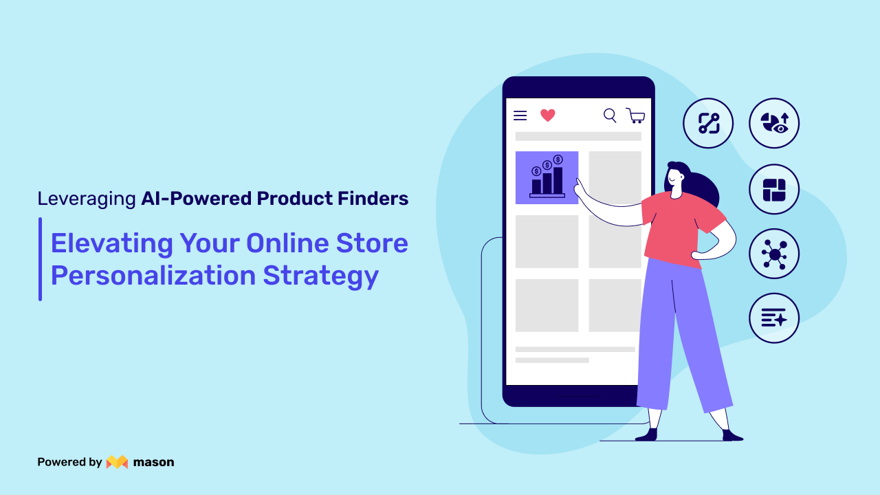
Customers value personalization a lot. Use landing page automation platforms to develop relevant landing pages that convert. You can personalize the title, photography, CTA buttons, discounts, and more using an automation platform.
4. Optimize your landing pages (Creative)
Your landing page must be aligned with the paid advertisements. The perfect mirroring of the landing page with paid ad motivates the customer to go forward to take your desired CTA.
Decide where you will place the CTA buttons. One CTA can be set multiple times on the landing page so that the customer can make an easy decision. Keeping distractions as low as possible helps the customer make a quick decision which positively impacts conversion.
It would be best to optimize the landing pages for desktops, mobile phones, and tablets. Ensuring a low bounce rate by making sure the landing page loads faster help with SEO optimization. Update your landing pages based on your marketing campaigns or social media goals and prevent content from getting outdated.
5. Conduct A/B testing
There is no way of knowing which landing page is the best without proper testing. Use different images, pictures, CTAs, videos, and layouts; test it on different customer segments. A/B testing will determine which type of landing page works best and tells us the kind of content customers prefer.
All you need to do is start with changing any one element on the page - picture, font, color, text, etc.
Now, you can test which CTA is performing better by analyzing the conversion rates and bounce rates of both the landing pages.
6. Leverage the power of User-Generated-Content (UGC)
Customer feedback and product reviews create social proof. You can leverage them to build trust among first-time website visitors. Social proof adds the extra incentive the customers need to purchase the product.
At times customers seem to like your product but might be skeptical, maybe because your brand is new to them. There is no brand awareness. Another reason might be that the customer has never used this product and doesn't know if it is worth purchasing. Customer testimonial (esp. video testimonial) helps the customer to decide with ease. You can provide special offers to your customers to share their testimonials on landing pages.
7. Optimize your landing pages (Conversions)
There is no point in investing in paid advertisements and building landing pages if they don't convert well. When someone clicks on your ad, there is a specific reason behind it. Failure to fulfill the customer's need as an eCommerce store owner will lead to low ROI.
The first step is to see that the paid advertisement redirects the customer to a landing page, not a product page. High traffic on your store and low conversion rates show that the customer is not getting the required value.
The second step is to ensure that the landing page perfectly aligns with the factor that led to the customer clicking on the paid ad. The above points will ensure that you get the most out of your ad spending and lead to high ROI.
8. Use appropriate videos and images
The right content helps achieve the desired conversion rates. Use high-quality photos and videos to get the right message to the right customer. Experiment with online lookbooks with pop colors and fonts.
If the landing page is for a first-time website visitor, it is essential to build trust. Nothing works better than User-Generated-Content and case studies to convert the visitor into a customer. In this case, using images and videos of customer testimonials and reviews and the product help.
If your product is very demonstration-dependent, you can use a video as a background on the landing page and place the other components on top of it. If the customer is a repeat customer, add images that acknowledge customer loyalty, like early access to sales and new launches.
We, as eCommerce store owners, can never overlook quality. Low-quality images with high loading time negatively impact SEO and increase bounce rates. Optimize the pictures and videos for all devices and ensure they fit the screen.
Captivate Customers with Landing Page Designs that Convert!
The above points prove that we shouldn't tread lightly on the potential of landing pages. Keeping your eCommerce store, paid ads, and email campaigns aligned to your landing pages will help you get higher returns.
You can easily view the reports of recently sent email campaigns by utilizing the EasySendy Pro and Drip application.
Mason, a content toolbox built for eCommerce stores, helps you build personalized and relevant landing pages with ease and much more.
Let's gear up to create landing pages that convert!


